Twitch layout?
I'm currently creating a layout / logo for my Twitchchannel it looks, but somehow extremely childlike, someone has an idea how I can do it
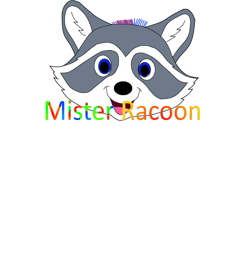
that it no longer looks so childish?
Here now, finally, thanks for the numerous answers.
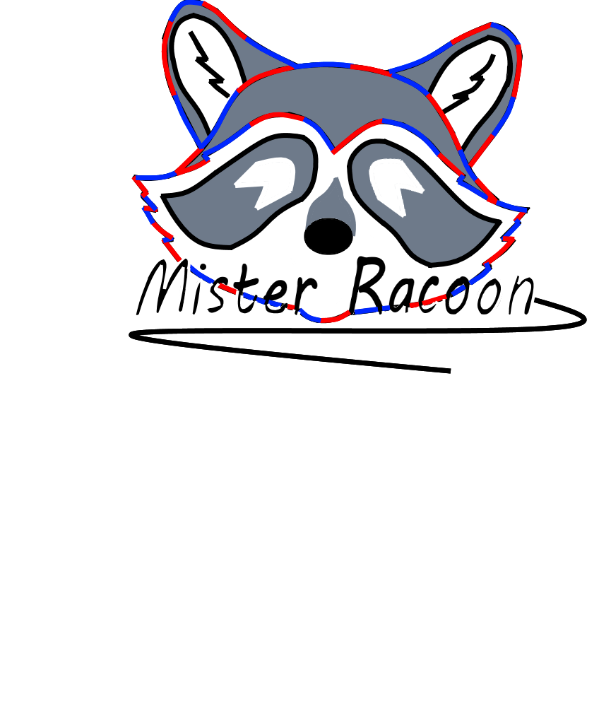
A curved, not colored font looks much neater.
Looks like from a coloring book.
Other fonts, not rainbow-colored and I think the raccoon is also worth revising.
Would personally paint the raccoon more minimalist and with thicker strokes to make it look more like a logo, if you know what I mean. So he looks too much like a cartoon character to me.
2nd answer:
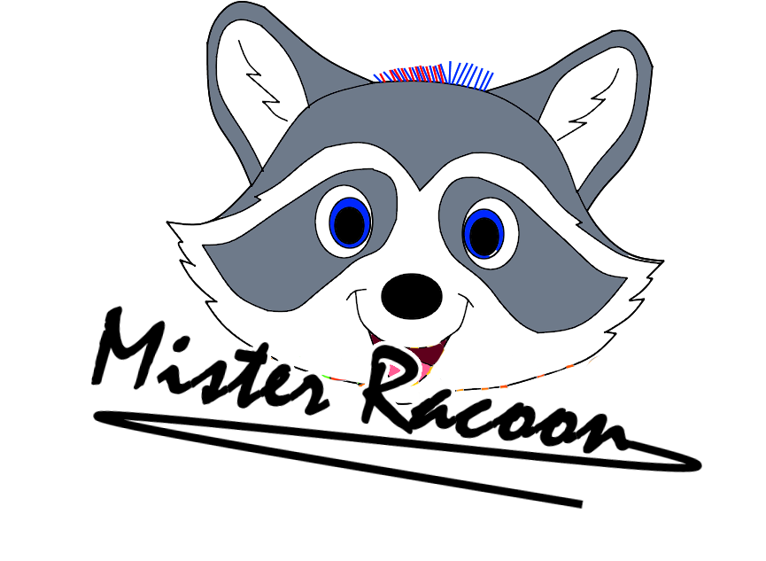
That's how I would do it. It is of course a matter of taste and is done quickly.
Thank you, I added another picture above.
Definitely looks better. I didn't know whether the red and blue lines on the head had a special meaning. If such a white border were added like mine, then I would be satisfied in your place.
It's really cute, drawing such a mascot is not easy. You should keep it a little simpler, that's better. If drawing doesn't work so well, you can ask someone who is familiar with it and who will do it for you, or you can take a finished picture and adapt it to your wishes.
look here if you like it: https://pixabay.com/de/vectors/tier-gesicht-logo-waschb%C3%A4r-2028258/
You could e.g. Also use this picture as a template. (You can find something bigger than this picture in google)
The raccoon itself doesn't seem childish, I would say.
As far as writing is concerned, you can try something out without it being too colorful. There are countless possibilities.
It's all a matter of taste, too.

Thank you, I've now added a final version above.
